Heal With Melissa | Client Spotlight
Mar 15, 2021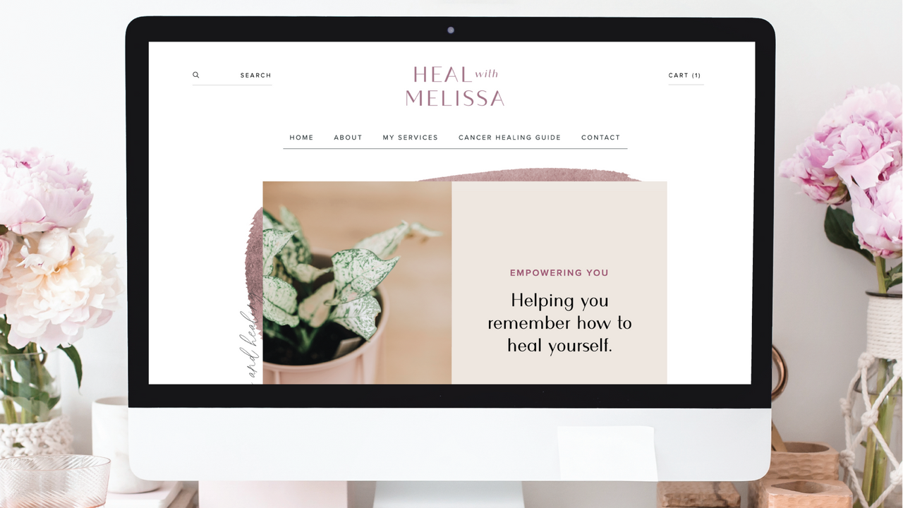
I’m so excited to share one of my most recent projects here. I recently provided brand strategy + design, including logo design, and website design and course design to Melissa, an intuitive healing practitioner, certified Reiki master, and yoga teacher. Her business is called Heal with Melissa and it was truly incredible to work with such a talented and inspiring woman!
Melissa is a two-time breast cancer survivor and uses her business to share the things she has learned throughout her healing journey. The task was to build a brand that embodied her unique approach to healing on a website that could adequately explain her offerings and the various services she offers. Since Melissa is a client who would frequently need to make easy changes to her website, I designed her site on Squarespace, one of the most intuitive and easy-to-edit platforms in existence. I’m fully confident she’ll be able to take control of this site and run with it as her business grows.
I designed Melissa’s course on Teachery. There are a lot of great options for courses, but again, knowing that Melissa would need to be able to make easy edits, I chose Teachery because I’ve found it to be the best for beginners.
I customized the design of her course platform for brand consistency. Melissa is unique for her ability to read emotions and understand physical and emotional energies, so her brand needed to reflect that thoughtful, sensitive tone. This is carried out throughout the website and her course, as well as her brand design itself!
As she states on her website, “The honey bee represents life, hope, and sweetness,” all things I’d say about Melissa, too. It was a beautiful choice to bring the honeybee into her brand design to represent her journey. The honeybee is reminiscent of nature, healing, and feminin strength. Melissa also says of the honeybee, “It symbolizes the impossible becoming possible through hard work and dedication. Bees are endowed with instinctual abilities to create the strongest natural structure found on the planet, the hexagon honeycomb.”
The hexagon also has a strong presence in Melissa’s brand as it represents strength, harmony, and balance. Melissa says to her clients and audience, “You have within you the ability and power to create your own strong structure, and to bring forth the sweetness of healing.”
I love the strength and empowerment of the resulting brand for Heal with Melissa. I can’t wait to see where this incredible lady takes her business with her new brand strategy and online materials!
Fun fact: One of my favorite parts of this project is her font. This font is described as a “varied” san serif font. It looks like a serif font at a glance (serif typefaces have the little “serifs” or swishes on the ends of letters) and having the look of a serif font gives it a familiar, comforting look. However, when seen up close, you recognize that it’s actually a san serif font, which is calm and modern, both appropriate for Melissa’s brand and audience.