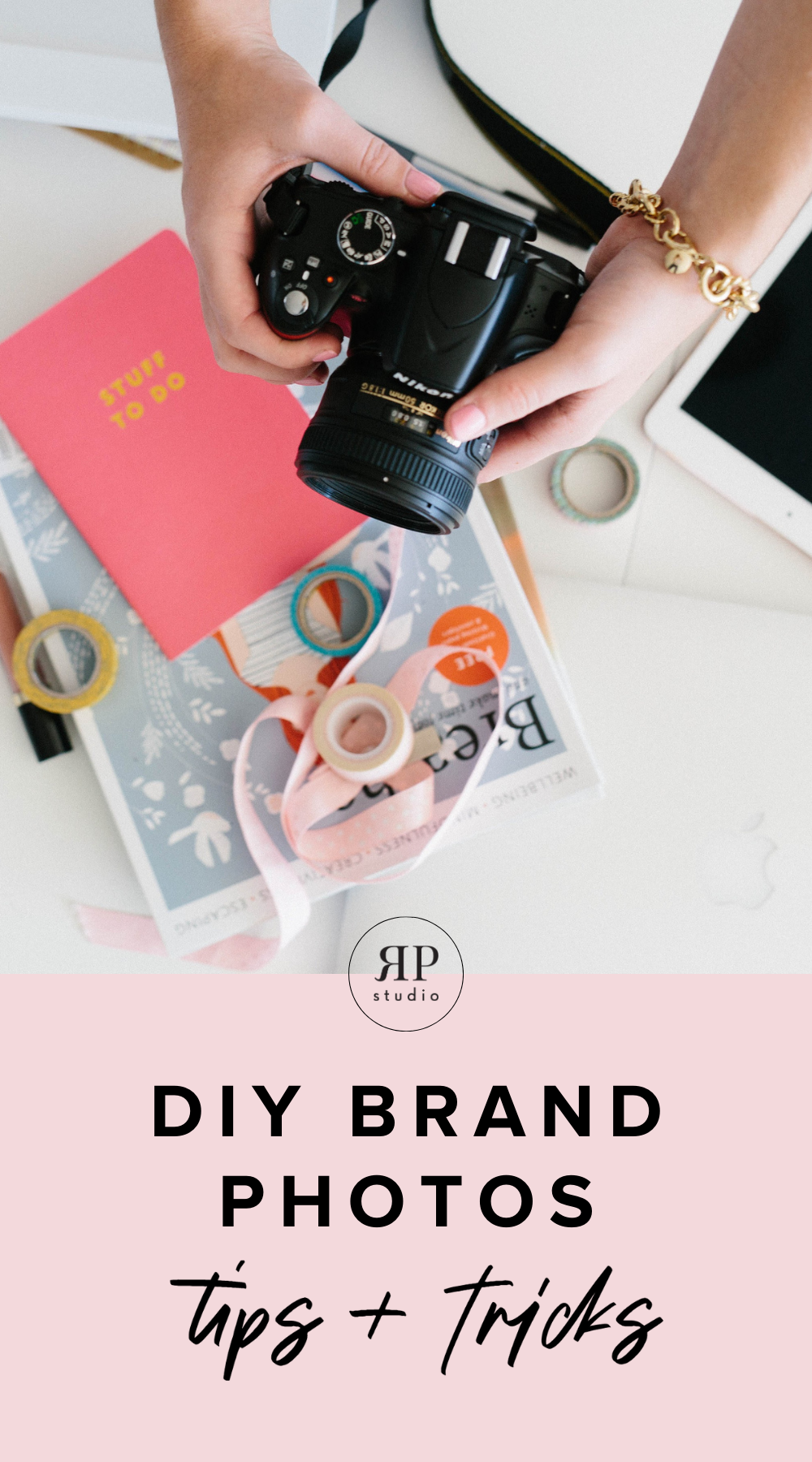
Easy-to-Implement Photography Tips for Non-Photographers
Mar 15, 2021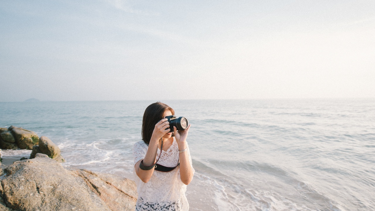
Not owning a DSLR or having the resources to hire for your creative business shouldn’t be what keeps you from beautiful photos that suit your brand. Let me share with you what I learned when I set out to improve my basic photography skills to benefit my business!
As a creative entrepreneur, I obviously wear a lot of different hats, meaning I feel many roles in my business. One of those responsibilities is photography. I’ve invested in professional photography for my business, but in a day-to-day sense, I like to be able to quickly snap a photo for my Instagram feed and not worry about it not being high enough quality for my feed.
A few years ago, I decided that I was tired of having dark, blurry Instagram photos and I wanted to up-level my photography skills. I started with my iPhone 4 and slowly progressed to where I am today.
I don’t claim to be a photographer (even though my skills as a designer have helped me understand the visual aspects of photography), but I do think my photography abilities have improved a LOT and I’ve picked up some realllllllllly useful tricks along the way.
I enjoy shooting product photography more than portrait photography, as that suits my business and my interests, but many of the basic principles I learned overlap between the two. Here is what I learned from my studies:
Lighting is crucial
The most important thing to recognize is the impact that lighting has on your success at taking photos for your business. You could have an expertly styled flat-lay with beautiful composition and texture, but it would all be ruined if you don’t know how to shoot that flay-lay in any light setting.
For all intents and purposes, I consider it a lost cause if I don’t have great natural light. Seriously. If the light isn’t great, I put my camera away and work on something else or share a graphic instead of a photo. I do prefer a soft, natural look (cooler colors suit me over warmer colors), but even if that’s not what you’re into, the lighting is still an important factor.
Here are a few more tips regarding your lighting:
- Shoot with your subject facing the window for more even light.
- If you’re shooting something on the floor, place it closer to the window for better light.
- If you’re shooting something on a table, place it farther away from the window so the light isn’t beaming down directly.
- Avoid using different light sources. When using natural light, turn off the lights in the room.
An overview of camera settings
One thing I’ve learned is that shooting in Manual is the key for me to get great photos. After you’ve figured out what f-stop, shutter speed, and ISO mean, it’s important to realize that there is a hierarchy of those settings (and they’re not as intimidating as I originally thought). Do a quick Google search to understand the relationship between the three settings and then you’re good to go!
Here are my tips based on how I set my camera:
- Aperture/f-stop is the most important setting (I never change my aperture from 1.8 because I really like that soft focus).
- Shutter speed is the next most important setting. To make sure your photos are sharp, never shoot below 1/125. Annie, my photography mentor, never shoots below 1/250, but if I don’t have great light (which I never do), I’ll go as low as 1/125.
- ISO is the last setting you should adjust. I keep my ISO at 100 because otherwise, it gets really grainy, but nicer cameras can look good anywhere from 100 to 800. If you can’t avoid using a high ISO, edit the picture in B&W and go for an “editorial” type shot.
- If you’re shooting outside and it’s too bright, bump up your shutter speed instead of your aperture so you don’t lose your soft focus. If you can, lower your ISO.
Another recommendation I’d give is to always shoot in RAW and export in JPEG, rather than shooting in JPEG. Shooting in RAW gives your camera the opportunity to capture more detail (which for me, means it lets in more light, which I usually need). Once I changed that setting to be the default, I’ve noticed an improved quality in my photography.
How to style photos
I generally use the same style “rules” for portrait photography and product photography. The hardest visual rule for me to grasp, which is surprisingly uncharacteristic of me and my nature as a designer, is the rule of thirds. Basically, imagine a tic tac toe board overlapping your frame, with the lines extending to all sides, You want the dominant subject of your photo to be centered on one of the four intersections. Following this rule will improve your photography skills ten-fold as the result is so much more visually appealing!
A few more rapid-fire “rules” I’ve learned to follow:
- Always put things closer together than you think they should be.
- People should always be touching
- Never cut people off at the edge of their limb. Cut them off in the middle of the limb and your eye will fill in the rest.
- Any well-composed photo should have three things: Color, pattern, and texture. If you always include those 3 elements, you’ll always have a great photo.
These tips and rules have helped me really improve my photography skills, as a non-photographer. Creative business owners of all varieties can benefit from having basic photography skills, so I hope these helped you as much as they helped me!