Courtney Burnett | Client Spotlight
Jun 18, 2021
Sometimes, I connect with a project so deeply that I know it’s going to stay with me for a long time. Working with Courtney Burnett was one such project! I love the work I did for her.
About Courtney and Her Business
Courtney is a IEP Coach and SLPA with ten years of professional training AND a mom of a special needs kid. She has the unique perspective of understanding the pain and frustration as well as the joy of helping special needs children become all they were intended to be, which made this project incredible for me as I was able to learn more about her perspective and her work through this project together.
Courtney has the valuable ability to be able to be both tough and kind. That balance plays a critical role in her ability to serve her clients. She holds space for everyone’s feelings in private consulting and facilitating communication between families and school administrators.
Brand Strategy
Courtney is that she is known as the “ultimate compassionate powerhouse” for moms of special needs kids. Our goal in working together was to create a brand that could encompass both the sensitive and the strong feelings embodied by that message.
Courtney's clients trust her because she is smart, compassionate, and determined to help them succeed, which allowed us to brainstorm elements of her brand (and the following mission for her business) that contained those same values and elements. Here’s a look at her brand vision:
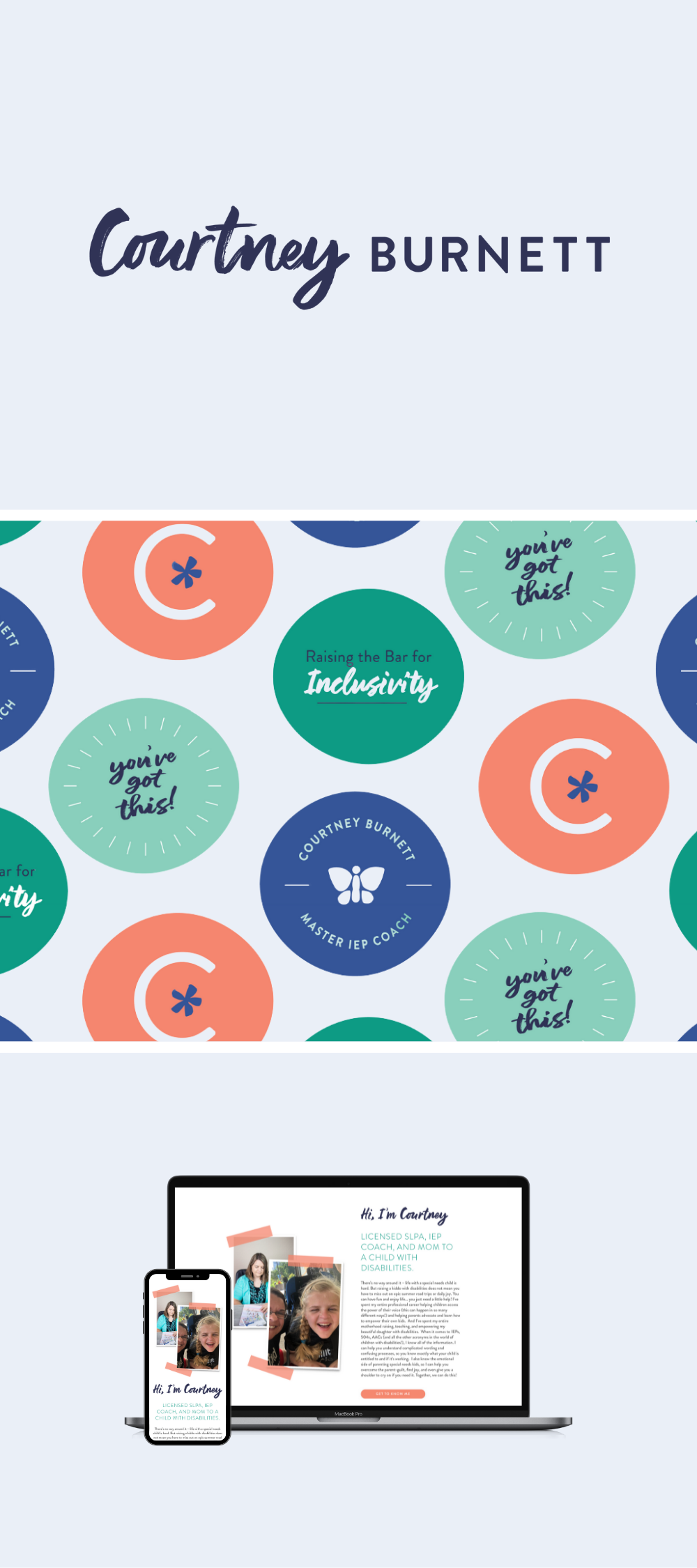
“We help parents of special needs kids get what they need for their kids to thrive so that they can start dreaming big about their future. We provide support through home-based speech therapy services, IEP coaching, legislative advocacy, and private consulting. Together, we can raise the bar for inclusivity in our schools, communities, and throughout the world.”
Isn’t that beautiful?
Brand Design
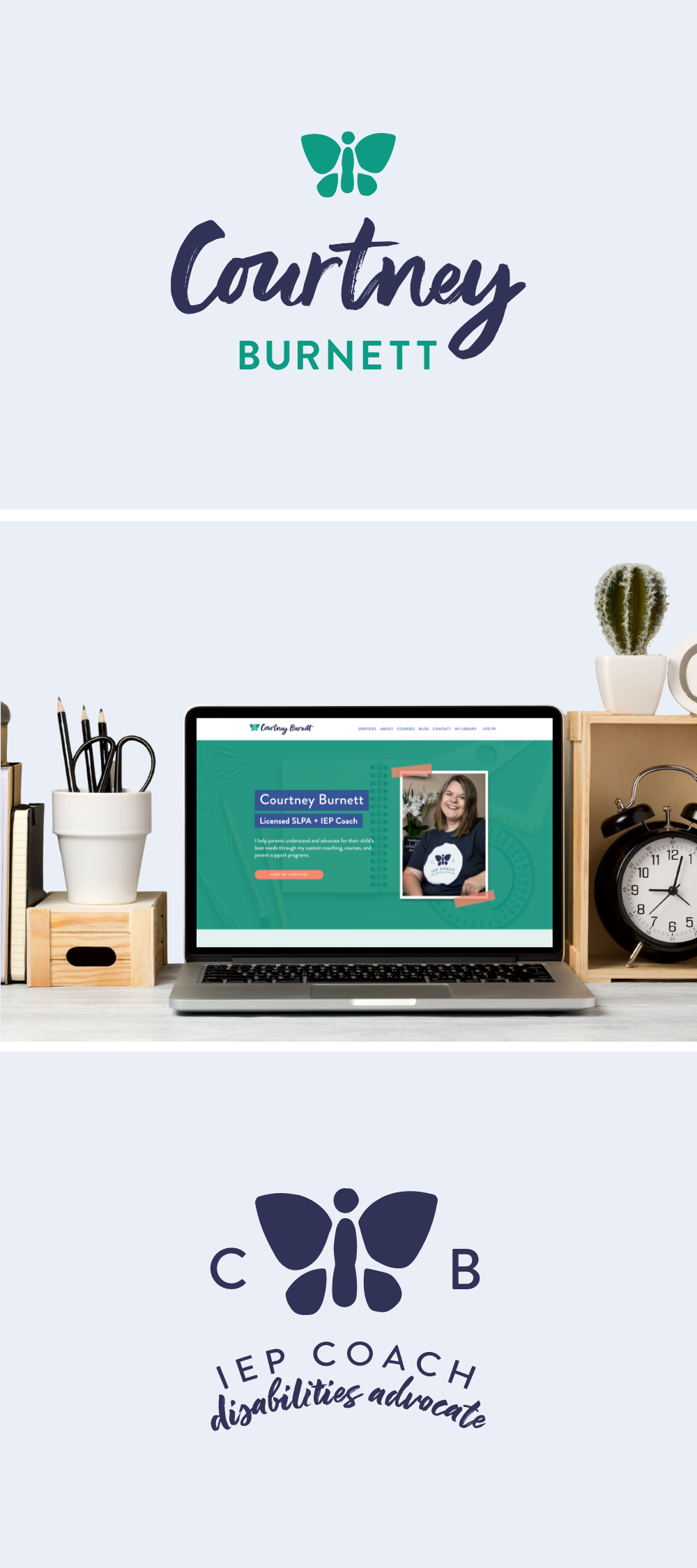
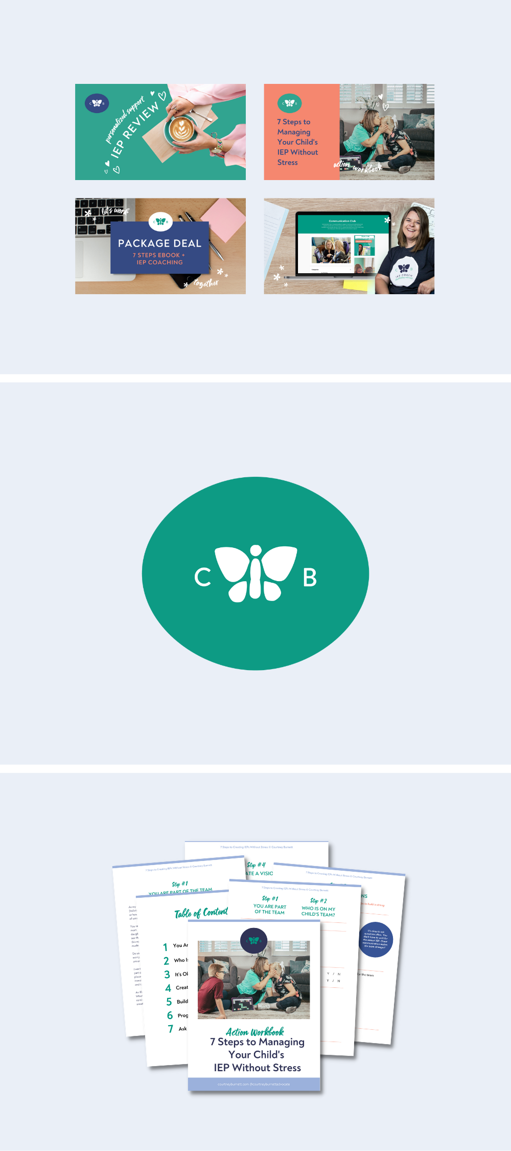
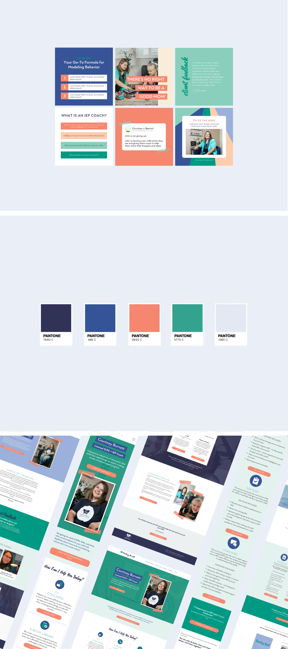
We focused on hand-drawn shapes that were unique and deliberately imperfect. The butterfly that looks molded rather than drawn symbolizes the art of becoming, beauty, hope, and transformation. A handwritten typeface was used for personalization and stacked elements to demonstrate order and professionalism. Courtney's color palette is a unique twist on the traditional colors of monarch butterflies, representing the change in perspective that comes (not usually by choice) for parents of special needs children. The brand as a whole communicates the power of beauty through transformation.
Working with Courtney challenged and shaped me as I’m sure it does her clients, resulting in a better view, life perspective, and commitment to myself that I’m sure her clients also enjoy.
To complete Courtney's project, we created a simple ten-page website with landing pages for each of her programs (and she celebrated her first two sales within 24 hours of launching)! Courtney's professional brand and website has allowed her to raise her prices by 25% and scale her business in ways she didn't think was possible.
How Is YOUR Brand and Website?
If you have a brand that makes a positive impact on the world, please reach out — I would love to work together!